Saturday 28 December 2013

The Top Five Artists' Watercolour Paints in 2013

Personal preferences were expressed in the product review poll "Which are the best artist-quality watercolour paints? (2012 / 13)" on my website Which is the best brand of watercolour paint for artists?

The chart below records the results of 360 responses.

Derived from
Which are the best artist-quality
watercolour paints? (2012 / 13)

The TOP FIVE WATERCOLOUR PAINTS IN 2013 are:

  1. Winsor & Newton - 27%
  2. M. Graham Watercolour Paints - 11%
  3. Daniel Smith Watercolor Paints - 10%
  4. Fine Schminke Horadam Aquarell - 9%
  5. Sennelier Aquarelle Extra - 8%
It's basically Winsor & Newton way out in front and then four brands - two American and two European - bringing in the next significant group of artist grade paints.

Those who are unfamiliar with M. Graham Watercolor Paints may be surprised they came second. However you should note:
  • Reviews of these paints generally provide high praise for the quality, saturation and lightfastness
  • 95% of those buying this paint from Dick Blicks would recommend them to a friend.
  • The Wilcox Guide to the Finest Watercolours gave high ratings to these paints across the watercolour range.
Below that most paints got little or no support of significance - although there is a good spread of those that did get votes

The chart below reflects the paints in the poll in alphabetical order - and indicates the percentage of the vote each attracted.

The ranking of different brands of paint - in percentage order - follows the chart


Ranking of Watercolour Paints


This is the final ranking for the 2012-13 Poll to identify
  • 27% - Winsor and Newton Artists Watercolours 
  • 11% - M. Graham Watercolor Paints
  • 10% - Daniel Smith Watercolor Paints 
  • 9% - Fine Schminke Horadam Aquarell
  • 8% - Sennelier Aquarelle Extra
  • 6% - Holbein Artists Watercolor
  • 3% - Royal Talens
    • Rembrandt
    • St. Petersburg Watercolors
  • 2%
    • Daler Rowney Artists Watercolours 
    • Kremer Pigmente Watercolors
  • 1% 
    • Da Vinci
    • Dr. Ph. Martin's Hydrus Fine Art Watercolor Paints
    • Grumbacher Watercolor - Finest
    • Lukas Aquarell
    • Maimeri Blu
    • Mijello Mission Gold Watercolors
    • Royal Talens - Van Gogh
    • Shin Han Premium Watercolors
The following paints failed to get a vote:
  • Art Spectrum Artists Watercolours
  • Blockx Extra Fine Watercolors
  • Holbein Irodori Antique Watercolor
  • Old Holland Classic Watercolours
  • Pebeo Fragonard Extra-Fine Artists' Watercolors
  • Robert Doak's Concentrated Watercolors
  • Stephen Quiller Watercolors
  • Utrecht Artists' Watercolors

I'll be posting a new Poll for 2014 in the next few days.

Tuesday 29 October 2013

Review: The Vanity of Small Differences

Grayson Perry's exhibition of the tapestries which make up The Vanity of Small Differences continues its travels around the UK .  This work is so good it gets its own tour of the UK! It's now reached Manchester City Art Gallery where it will be on display until 2 February 2014. Well worth visiting if you can get to Manchester! (More details at the end of future tour dates!)

The tour prompts me to review the Catalogue of the tapestry project of the television programme. I'm really pleased to have been sent a copy of the book of The Vanity of Small Differences for review.

Front Cover of the book of the exhibition of the tapestries arising out of the television series!
by Grayson Perry
Published by Haward Publishing

Background: A brief synopsis of the artwork and how it came about

The Vanity of Small Difference is a very important piece of contemporary art - which was conceived as a public work of art. It comprises six Tapestries listed below together with links to Grayson Perry's explanation of what the tapestries are about.
The piece explores British taste. It's a contemporary version of Hogarth's 'Rake's Progress' and also reprises classic artworks (puns in the titles of tapestries provide clues!) in contemporary form. It all started with a safari around UK. Grayson Perry visited different groups of people - in Sunderland, Tunbridge Wells and the Cotswolds - which resulted in a BAFTA award-winning Channel 4 series ‘All in the Best Possible Taste with Grayson Perry’ (2012). His visits to places strongly identified with social classes investigated the taste of the different tribes of people in terms of class and social mobility and unearthed more than a few surrprises.  

The other thing you need to know is that Grayson Perry is very intelligent, acutely observant of contemporary mores - and finally, he's truly astonishing in the way in which he manages to be both very articulate with very accessible.  I'm a  huge fan!

Synopsis:  This book is the catalogue of the exhibition of The Vanity of Small Differences - an iconic piece of contemporary art based on research by Grayson Perry into contemporary taste, social class and class mobility. It tells the story - and shows us the processes - of how he developed tapestries telling the story of Tim Rakewell and his progress through life to his death. The name is a link to the Tom Rakewell of the Rake's Progress. The book explains how the tapestries came about and provides a commentary on what they reveal.
Summary review:  HIGHLY RECOMMENDED: This is an essential guide to a multi-layered, culturally rich and very important set of tapestries. A contemporary tale, an iconic artwork - and an interesting story about how the tapestries were produced plus excellent publication values all combine to make this both a very interesting and a very high quality publication. 
Average customer review
Highlights
  • a visual narrative of what it is to be English today - in terms of taste and associated visual aesthetics 
  • a great read - in terms of the essays. A stronger sense of the morality tale which underpins some of the narrative of the tapestries. 
  • the research is represented by a portfolio of annotated photographs - with some surprising captions
  • Perry's sketchbooks are a delight. In these he developed the themes, the storyline and finally the sketches for the tapestries. Plus added annotations about the artwork and notes of key themes for individual tapestries.
  • Superb illustrations of both tapestries and details. each individual tapestry enjoys a folded panoramic pullout - which means we get to see them very much bigger than the size possible on a conventional page. Plus details enable one to see the way the tapestries are woven and how the colour transitions work - which is an aspect I found particularly interesting - scumbling on a loom! Plus who knew that looms are now digital and can produce a large tapestry in about 5 hours?
Think Again?
  • Those who have no connection with figurative artwork or social commentary 
  • Those who have no interest in the fascinating process which generated the tapestries
Who should buy this?:
  • Fans of Grayson Perry - whose fan base seems to be increasingly exponentially. He's on his way to becoming a "national treasure" if not there already! 
  • people who want an example of how to be unique; how to make art which is different
Who should not buy this?
  • Those not interested in tapestries, contemporary art or social comment
Author: Grayson Perry
Publisher: Hayward Publishing (UK 10 June 2013 | USA 31 October 2013)
Technical data: Hardcover| 128 pages | 21.5 x 25 cm | 120 colour and black and white illustrations
  • ISBN-10: 1853323152
  • ISBN-13: 978-1853323157
Paperback: No
Available as an ebook? No - however an app about the Tapestries is available 


Digital guide


The Arts Council Collection have created an app for iPad and iPhone. This gives you commentary on Perry's perspective, details art historical references and provides a guide to the making of the works. You can see the tapestries up close with detailed zoom facility and have Grayson's own audio guide. Reproductions of the classical referenced artwork are disappointly tiny. They work better when accessed via the interactive aspect of the app.  The bonus is Grayson Perry reading the words associated with each tapestry and highlighting the similarities between classical painting and his tapestry.

The digital guide,Grayson Perry: The Vanity of Small Differences, is available only on the App Store (£1.99).

The Vanity of Small Differences - The Tour

Exhibitions to date


These include the following. The link in the title is to the exhibition page at that location.
  • Gallery I Victoria Miro, 16 Wharf Road, London N1 7RW (7 Jun - 11 Aug 2012)
  • Sunderland Museum and Winter Garden - the location for two of the patesries  on 28 June, as part of the Festival of the North East which celebrates the return of the Lindisfarne Gospels to Durham Cathedral. It is of particular significance that the works begin their public tour in Sunderland as this is where Grayson sets two of the tapestries, The Adoration of the Cage Fighters and The Agony in the Car Park. 
  • Perry’s own edition of The Vanity of Small Differences was displayed as part of the Royal Academy of Arts Summer Exhibition 2013 (June - August 2013) - see my review 10 reasons to visit the RA Summer Exhibition 2013 - my #1 reason was the set of tapestries which got a room to themselves.
  • Manchester Art Gallery (24 October – 21 January 2014)

Future Tour Dates:

  • Birmingham Museum and Art Gallery (14 February – 11 May 2014), 
  • Walker Art Gallery in Liverpool (May – August 2014) and 
  • Leeds City Art Gallery (1 August – 1 October 2014). 
  • An international tour will follow. 
The Art Fund and Sfumato Foundation are supporting the UK tour of the tapestries, as well as education and interpretation materials for the UK tour

Friday 4 October 2013

Book review: One Drawing a Day

This review kicks off the The Big Drawing Book Review 2013 - which I introduced on my main blog Making A Mark.  

It follows on from The Big Drawing Book Review in 2007.  There have been so many new books in the intervening years I thought it was time for another one! You can find out how you too can participate by reading my introduction blog post (see first link above).

It seemed appropriate to start with a book which encourages people to draw.

This then is a review of One Drawing a Day: A 6-Week Course Exploring Creativity with Illustration and Mixed Media by Veronica Lawlor.

The key distinction of this book is that it grew out of a blog created by professional illustrators and art educators which has been more or less posting one drawing a day each month since June 2009.


Synopsis:  This is a structured daily drawing course exploring creativity with illustration and mixed media which allows you to pick and choose the order that you complete the work. The author proposes readers should do 42 daily exercises - one drawing a day - over a period of 6 weeks. Drawing is a euphemism insomuch as in this book it also involves sketching with paint. The focus is on expressionism rather than realism.
Summary review:  This is a book to stimulate those who’d like to improve their drawing and sketching - and to reinvigorate those who know how to draw but need to stay fresh and inspired by what they see and how they draw/sketch/paint. In my opinion, it’s too challenging for beginners but would suit those who like experimenting and want to widen their repertoire of skills and improve their drawing in terms of interpretation and impact. It's both
  • A handy book to have around when your drawing goes stale. 
  • A good book to consult if you want to make progress with your drawing without going to class.
Average customer review
Highlights
  • the structure of the exercises is flexible - it provides a framework but you can choose what you want to do
  • The Exercises:
    • Push the boundaries of conventional art-making for novice artists and those with no formal education in art and illustration
    • Recommend subject matter to focus on and media to use
    • Focus on observation from the real and not drawing from photos
    • Provide quick tips for those skim reading! They contain some very useful information - I learned a few new things!
  • the book advocates a wide range of materials to use for drawing and sketching - including ink and paint washes which both need brushes. Excellent demonstration of different ways you can use a range of art materials - stimulating for those who like mixed media
  • Very nice production values - design and format are contemporary and easy on the eye; quality of reproduction of images is good
  • There are two social media sites associated with this book where you can see the artwork triggered by use of the book
    • this is the blog One Drawing a Day written by the members of an illustration collective called Studio 1482. There are blog posts most days.
    • There is an a Flickr group - One Drawing a Day. Note that some of the people who participate are adult professional artists.
Think Again?
  • Exercises may feel routine to some with a formal art education - on the other hand it’s nice to have a reminder! 
  • If you are apt to take words very literally, you may feel some of the exercises are a major challenge. Try thinking how you can use the intent and vary the subject matter 
  • The sketches are very “sketchy”. The style is fine by me but some people who like drawings to be “realistic” might not like it. I say “Don’t knock it until you’ve tried it!” (NB It took me 10 years to loosen up the way I drew!) 
  • The book lacks variety in terms of different styles of drawing and sketching compared to the variety of sketches seen elsewhere in other books and other projects. Probably connected to the content having been produced by an artists’ collective (Studio 1482). 
  • Those who want to stay home and draw might not like the fact that the book includes exercises which involve getting out and about to draw and sketch 
  • Those who want to stick to one medium which makes them feel comfortable may not appreciate the challenges to their skills and techniques 
Who should buy this?:
  • Artists and illustrators who’d like to keep their drawing regular, fresh and creative 
  • People who like structured exercises to complete to create a discipline of habit 
  • People who like experimentation 
  • People who like trying and using different media and mixing media 
  • People who want to devote more time to sketching and need some ideas to get them going 
  • People who like engaging with related social media sites 
Who should not buy this?
  • Those wanting to learn how to draw - from the very beginning. I don’t think this is a beginners’ book. it assumes a lot of prior knowledge of art materials and that you will “get on and do” on your own. 
  • Those who want to take their time and draw very precisely 
  • People who like to draw using photographs - unless they want to break away from this limited approach to making art
Author: Veronica Lawlor + others (all are professional illustrators and/or art educators)
Publisher: Quarry Books (1 October 2011)
(Note: Studio 1482 artists Greg Betza, Margaret Hurst, and Veronica Lawlor are also featured in the Quarry Books release “The Art of Urban Sketching“) 
Technical data: Publication Date: 2011
Paperback - 128 pages
Available as an ebook? Yes - Kindle version available on Amazon
Also available as an ebook via iTunes for reading on an iPad 

This book will feature on a new website I'm creating.  

This is my main website about drawing books (which is currently being redesigned) The Best Books about Drawing and Sketching 


Saturday 14 September 2013

Print on demand: top choices are Zazzle and Fine Art America

Zazzle and Fine Art America are the most popular choices of artists using print on demand services for their artwork.  

Print on demand is a service where you upload an image and a company fulfils all orders for a giclee print, invoices, processes payments and despatches the print on your behalf - for a fee.  many artists like it as they can make money from their artwork even if the original has been sold and can spend more time on making art and less time on doing the administrative aspects.

However print on demand doesn't just happen - just as with original art, you still need to work at the marketing!

But which site offers the best service?

My poll which investigates which print on demand service artists like best has been running on my website dedicated to Print Art on Demand - Resources for Artists since last August.  You can see it below.

POLL: Which "Print on Demand" site for art prints do you like the best?

Poll ran for 13 months
from 14 August 2012 - 14 September 2013

The poll ran for 13 months between August 2o12 and Sepetmber 2013. I'd have liked the poll to have been bigger - that said it still represents responses from 64 people, some of whom have also left comments on the website.

Key results
  • Zazzle managed to snare nearly a third of the print on demand clients 
  • a quarter opted for the services of Fine Art America.
While the traffic for Cafepress and Zazzle is ostensibly similar, it's very clear that Zazzle is the site of choice for smaller and less fine art oriented items with images. Zazzle continues to remain very popular with artists wanting to sell at the 'popular art'/low priced end of the market

Upon further investigation, while there's not that much to choose between them in terms of traffic in the summer months, Zazzle absolutely thrashes CafePress at Christmas with some 2 million more visitors (9+ million compared to CafePress's 7+ million).  So if you want customers for your art at Christmas you might want to give Zazzle a try.

Zazzle also has the snazziest looking website - which is bang up to date.  It's already got its offerings up re. putting artwork on the new iPhone cases on its home page!

Redbubble is close to the Zazzle and Cafepress end of the market - however the general consensus is that this once popular Australian based firm has maybe peaked.  It's been giving an impression of a site which lost its way in business terms.  The website also has a more conventional look about it. A number of people have been looking for other venues since they changed the way they do business.

Fine Art America is a more popular choice for those wanting to sell fine art prints of their artwork on demand - with the company doing all the necessary to fulfil the order.  One of the aspects artists appreciate is the fact that they can choose whether or not Pinterest can pin their images or not - it's their choice, not a choice made for them by the website.

What I like about Fine Art America is that all the basics are explained - with a decent amount of detail - all on one page.  You also have the chance to sell prints direct from your own website.  With a premium membership you can also sell your art via Amazon.com.  On the other hand, its sop site is by far the most traditional looking and is likely to attract an older customer.  In my view, Fine Art America could do with reviewing how its site stacks up compared to the competitors.

My original choice of website for prints (Imagekind) was spot on in terms of quality of print - and absolutely dreadful in terms of their business model and their overall approach to growing the business.  So while you can see my prints via my website I have been giving some thought for a while to switching to a new provider.

I'm not really into selling mugs and mousemats so I'll probably skip Zazzle and give Fine Art America another close look.  I'm also going to check out some of the photography websites which have well organised ecommerce options and will then review the options.

One thing I would say is if you've not given ALL their websites a once over for quite a while, I think you'll notice quite a bit of change.  Maybe time to take another look?

Please share your views


Please let us know your experiences of different print on demand websites either here or on Print Art on Demand - Resources for Artists

Friday 13 September 2013

Palettes and colour charts with a difference

Colour Chart Coasters
A lot of artists I know are very fond of collecting trivia which is artist related - and this is a post for those who have a tendency to buy art tools on items wholly unrelated to the studio.

Those clever people at the National Portrait Gallery shop have been exploiting this tendency of late with a fantastic range of goods based around a colour chart and a palette.

In this post, you can see the two items I bought this summer  - and am very happy with. However I can't identify them in the shop and am wondering if either they are now only available in the shop - or they've sold out!

Artist's Palette fridge magnet
For the record: the colour chart coasters were £14.50 and the artist's palette fridge magnet was £3.50.  They're suitably practical to justify the price while being a great deal more attractive and appealing to me than alternatives fulfilling the same function.

The palette is actually based on George Johann Scharf's small china palette and is 19 x 15cm. Scharf was a German artist who chronicled 19th century London - which you can read about in this blog post.

There's also a small Small China Palette brooch of the same design available from the website.

Plus links to more of the same in terms of the colour chart design - but different online.  I'm very taken with the Colour Chart tea towel.

I do like the National Portrait Gallery shop - and I highly recommend it for a browse if you're in this area of London with a few minutes to spare.  They have a habit of coming up with items which are slightly quirky and better quality than one might find elsewhere. Some are somewhat highly priced but if you pick and choose you can have a small indulgence for not very much at all!


Friday 23 August 2013

Color Studies by Edith Anderson Feisner - NEW 3rd Edition

A NEW 3rd Edition of Color Studies by Edith Anderson Feisner and Ron Reed has just been published in the USA (21 August 2013).

It should be available in the UK in either September or November depending on which reference source you read.

It's even worth buying just as an investment! Without even having seen it, the value at which the 2nd edition (which I own) now trades for on the Internet suggests that this 3rd edition should be snapped up immediately by all artists who like owning very good books about colour.

This is the book I always used to recommend to people wanting a complete overview of Colour as a topic for artists prior to the publication of Colour and Light by James Gurney.

I can't think of a reason why I wouldn't continue to recommend it very highly since it will be the old contents - with new chapters.  Feisner takes a different approach to Gurney and also has content not found in Colour and Light

Here's the Table of Contents of the NEW 3rd Edition
Table Of Contents

Part I: Color Foundations

Chapter 1: What is Color?
Chapter 2: Color Systems and Color Wheels
Chapter 3: Color Theorists
Chapter 4: Coloring Agents
Chapter 5: Digital Color Media and Technology

Part II Dimensions of Color
Chapter 6: The Dimension of Hue
Chapter 7: The Dimension of Value
Chapter 8: The Dimension of Intensity
Chapter 9: The Dimension of Temperature

Part III: Color in Compositions
Chapter 10: Color and the Principles of Design
Chapter 11: Color and Elements of Design
Chapter 12: Color Interactions
Chapter 13: Color and the Effects of Illumination

Part IV: The Influence of Color
Chapter 14: Color Symbolism
Chapter 15: Putting Color to Use— Past, Present, and Future

Appendices | Glossary | Bibliography
Bloomsbury Books in the UK indicate that the new content is as follows
Feisner and Reed provide an up-to-date discussion of sustainable color applications and green materials as the underlying component of colorants, dyes, and inks in textiles, printmaking and paints. A new chapter on color and digital technology discusses illuminating with color (LED), color tools and management (Pantone), as well as color consulting and marketing.
This is what I had to say about the second edition back in 2008 (on Making A Mark - in Learning about Colour - Art Book Reviews for Artists #1)

This is the most comprehensive book about colour that I've come across to date. It's accessible but I think it likely that it would be of most interest to colour nerds (like me)! Preview this book and the full contents guide on Google Books. This is what it provides:
  • explanation of the five main colour wheels and their application
  • a historical account of colour theory plus a chronological list of colour theorists (unique?)
  • a historical account of pigments and their use in fine and applied art plus a list of historical colour palettes linked to current colour code.
  • analysis of the four dimensions of colour - hue, value intensity and temperature
  • colour in composition - in relation to the principles and elements of design
  • colour symbolism - including colour symbols in religion
  • a thorough glossary of colour terms
Intervaled scale: A color scale that forms a smooth equal visual transition from one component of the scale to the next
Glossary - Colour by Edith Anderson Feisner
  • over 75 colour charts
  • over 100 works by students and well known artists
  • coloring agents:
  • dry binders
  • liquid binders
  • pigment origins and characteristics of common colours
  • hue - various art media (eg Liquitex Acrylic Paints) matched to colour-aid paper pure hues
  • color legibility rankings (background colors and lettering/line colors) Did you know that the most legible background colour is yellow?
  • a very comprehensive bibliography

Details of the 3rd edition (UK)

Details are provided by Bloomsbury Books in the UK. It's being published as a Design Book.
 
Published:21-11-2013
Format:Paperback
Edition:3rd
Extent256
ISBN:9781609015312
Imprint:Fairchild Books
Illustrations:355 illustrations
Dimensions:280 x 215 mm
RRP:£54.99
Online price:£49.49

Authors

The book seems to have acquired a new author for the 3rd edition.  It may be Ron reed who has provided the new material in this 3rd edition. The two authors are

  • Edith Anderson Feisner - a Visiting Specialist / Assistant Chair (Retired) in the School of Fine Arts at Montclair State University, USA. She has taught courses in color, design, and introduction to visual arts. She has held many positions in the Embroiderers' Guild of America including certified teacher, teacher certification board, as well as the author of the master craftsman programs in color and design. Her fine art works are in both public and private collections. 
  • Ron Reed - an Assistant Professor and Program Coordinator for Interior Design in the School of Family and Consumer Sciences at Texas State University-San Marcos, USA. Reed served as the IDEC Southwest Regional Chair between 2011-2012.

Wednesday 12 June 2013

Luminance 6901 Coloured Pencils - comparative prices for open stock

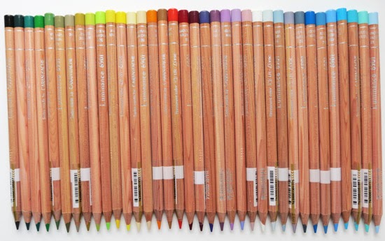
I've had a bit of a splurge on Luminance 6901 Coloured Pencils by Caran d'Ache!  Here's my haul from Monday's Private View of the Pastel Society Exhibition at the Mall Galleries 

Caran d'Ache Luminance Coloured Pencils
£2.49 each from open stock at the Pastel Society Annual Exhibition!
I've been building up my stock of Luminance Coloured Pencils slowly - because they are expensive.

I love their intense pigmentation, the way they go down and the degree of coverage I can get without effort.  However most of all I love the fact they are the only accredited lightfast coloured pencil range on the market - as in "meets the International 6901 Standard".

For me, if you're producing coloured pencil artwork for sale you must use lightfast pencils which will not fade - guaranteed!

If I have to choose, I prefer a pencil which meets an accredited technical quality standard on lightfastness rather than one where I have to rely on the quality assurance of the manufacturer. I see my preference reflected in the way other media has changed in recent years - and so it will come to pass it will happen to coloured pencils too - in time.

Caran d'Ache Display Stand
at Pastel Society Annual Exhibition
at the Mall Galleries
However there's no getting away from the fact that Luminance 6001 pencils are expensive.  I don't mind that so much - quality costs etc.  However it does mean I'm building a collection from open stock rather than laying out a huge sum to buy the whole range.  [ Note: I've listed the comparative prices from different suppliers at the end ]

So when I see pencils for sale at a much reduced cost (£2.49 per pencil ) I stand in front of the display stand and work out how many I can buy without making my eyes water.

Turns out on Monday night it was rather a lot - see the pic at the top.

These are very much "me" colours - i.e. the colour palette I like to work with so my new collection both provides back-up pencils and some new colours I've not worked with before.

This is the complete colour chart for Luminance Pencils

I may just have to go back and get some more - that's if you don't beat me and get there first!

For more about the different brands of Coloured Pencils see my website Coloured Pencils - Resources for Artists.

Note: Caran d'Ache are sponsoring the Pastel Society Annual Exhibition - hence the display stand of coloured pencils and pastel pencils etc in the Mall Galleries.  It also has other Caran d'Ache products and Luminance 6901 pencils in tins.


Comparative prices for Luminance 6901 Pencils in the UK

Comparative prices for Luminance pencils bought as individual pencils from open stock are listed below together with indications as to postage costs for pencils bought online.

Product
Luminance 6901 coloured pencils | OPEN STOCK
Recommended retail price:  £2.99 or £3.10 Depends on who is quoting it!
Name of Retailer
Face to face
£ price
Online
£ price
£ postage
Amazon

£2.70
Various options
Jackson Art
£2.70
£2.70
Free over £39
Artifolk

£2.69
Free over £10 
Pencils4Artists

£2.55
£1.95
Mall Galleries
£2.49

n/a


Note:  The Mall Galleries price only applies for the duration of the Pastel Society Annual Exhibition which ends on 22 June.  Caran d'Ache are the 2013 Sponsors of the Pastel Society Exhibition.


Related Posts Plugin for WordPress, Blogger...